The Importance of Data Visualization in Coin Collecting
Why Seeing Your Collection in Charts Feels Like Magic
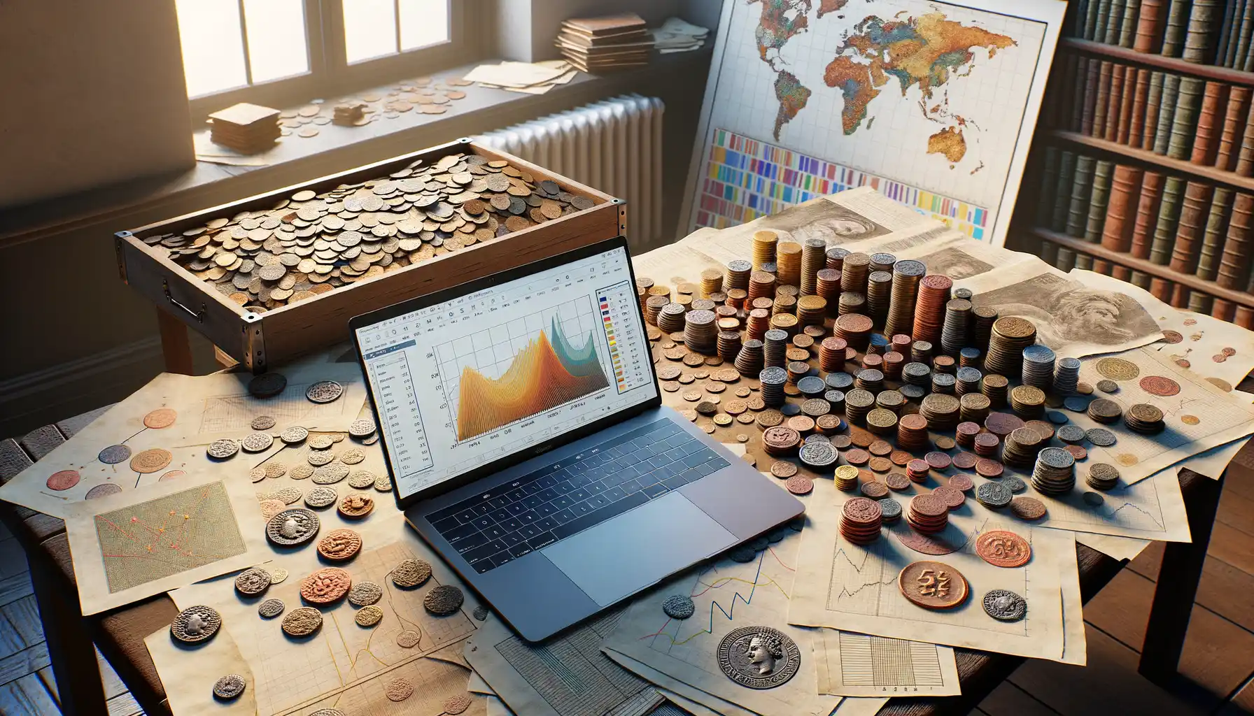
Ever felt like your coin collection is a treasure chest of stories, but it’s hard to tell those tales without overwhelming others—or even yourself? That’s where data visualization enters the picture, shaking things up like a game-changing secret weapon. Imagine transforming a sea of coins into colorful graphs and interactive charts that speak volumes at just a glance. It’s like turning a dusty journal into a masterpiece of modern art.
By visualizing your stats, you unlock new perspectives. Pie charts can show you the percentage of coins from certain centuries, while heatmaps might highlight the regions where your rarest finds originate. The brilliance? It shifts your collection from being just “a thing you love” to something with layers upon layers of meaning.
- Spot duplicates you didn’t know were hiding in plain sight.
- Track trends, like which years or mints dominate your collection.
- Uncover gaps—your ultimate wishlist for future hunts!
Data visualization brings personality to numbers, weaving together facts and feelings. It’s not just organizing your collection; it’s writing the story of who you are as a collector.
Choosing the Right Tools and Software for Visualizing Coin Statistics

Finding Your Perfect Visualization Sidekick
When it comes to visualizing your treasured coin statistics, the right tools can feel like a superhero’s cape – they give you power and make your data shine. But not all tools are created equal, and choosing one can be as tricky as spotting a rare misprint on an old penny.
Here’s the thing: your needs should guide your choice. Are you a minimalist who just wants crisp, clean charts? Or perhaps you’re a storytelling enthusiast, ready to find software that lets you create graphs with a little extra pizzazz.
- Microsoft Excel or Google Sheets: Fantastic for beginners or those working with simple datasets. Add some colors, tweak the axes, and voilà – basic but effective visuals.
- Tableau: Think of it as the Picasso of data visualization. It’s for those who crave intricate, interactive dashboards where every coin’s detail pops off the screen.
- Canva: Yes, the design darling has chart tools too! Perfect if aesthetics matter as much as numbers do.
Remember, finding the right tool is like matching a rare silver dollar with its perfect display case. Choose one that enhances – not overwhelms – your collection’s beauty.
Testing Tools for a Seamless Fit
Here’s my advice: don’t commit too quickly. Just like testing a new coin album, try before you buy (or download). Many tools offer free trials, so dive in! Create a chart, insert some dazzling coin data, and see how the interface feels.
Does it allow customizations like adding specific mint dates or regions? Does it handle large datasets without throwing a tantrum? A trustworthy tool will not only be user-friendly but also smart enough to make you feel like a pro.
And hey, don’t shy away from mixing tools! Use one for crunching numbers and another for stunning visuals. In the end, your coin collection deserves nothing less than the very best showcase – data and design, working in harmony.
Techniques for Presenting Coin Data Effectively

Making Your Coin Data Shine
Presenting coin data effectively is like displaying your prized coins under perfect lighting—every detail should grab attention and tell a story. The key is to tailor your approach so even non-collectors can feel the excitement behind those numbers.
Start by thinking about **what your audience craves**. Are they fellow enthusiasts? History buffs? Beginners curious about rare finds? For example, if you’re showcasing mint origins, a map infographic could add a splash of color and geography to your collection’s narrative.
Sometimes simplicity wins. Use interactive pie charts to compare percentages of different coin types—silver vs. gold, ancient vs. modern. Or go bold with bar graphs for auction prices, letting those eye-popping values truly stand out.
- Custom color coding: Assign distinct shades to eras or regions of origin for quick visual patterns.
- Annotations that pop: Highlight record-breaking coin values in your graphs with brief notes to spark interest.
Adding personality works wonders too. Share a fun anecdote or an “aha moment” from your coin-hunting adventures alongside the visuals. These stories make the data feel alive rather than just static numbers on a page.
Using Charts and Graphs for Coin Collection Insights
Bring Your Coin Collection to Life
Ever felt like your coin collection is a secret treasure chest that only you can decipher? Well, with the magic of charts and graphs, you can turn that hidden trove into a vibrant story that everyone can understand. Imagine showcasing your rare 1909-S VDB Lincoln cent not just as a number, but as part of a colorful bar graph comparing its rarity to other coins in your collection—it immediately becomes unforgettable.
Using visuals, like pie charts or scatter plots, transforms plain data into intuitive insights. For example:
- A pie chart can reveal the percentage of coins from different regions—did you know 40% of your collection might be from Europe?
- Stacked bar graphs break down how your collection has grown over time. It’s like watching your passion bloom right before your eyes.
Discover Patterns You Never Knew Existed
Have you ever noticed trends in the metals or mint years dominating your collection? A simple line graph tracking coin values over decades can show fascinating spikes, like those shiny 20th-century silver dollars rocketing in worth. Suddenly, your hobby isn’t just fun—it’s strategic.
By embracing these visual tools, you’ll uncover stories within your coins that even Sherlock Holmes would envy.
Best Practices and Tips for Engaging Visual Presentations

Keep Your Audience Hooked with Visual Magic
Imagine your coin collection stats coming alive like a treasure map leading to untold riches. To captivate your audience, you need more than just polished charts — you need storytelling. Use colors wisely; think of them as your palette. A mix of muted tones with bold accents can direct attention to key points, like a spotlight on your rarest coins.
Another secret? Keep it simple. Overloading your visuals with too much data is like dumping a pile of coins in front of someone and asking them to find the rarest one—overwhelming! Instead, let each slide breathe. Highlight trends or insights, such as the growing value of 19th-century coins, and save the nitty-gritty for handouts.
- Be intentional with fonts: Stick to clean, legible typefaces that won’t distract from your message.
- Use animations sparingly: A subtle fade-in can impress, but bouncing text? Not so much.
Master the Flow Like a True Storyteller
Every great presentation has a rhythm. Start with a hook—perhaps a jaw-dropping stat, like the percentage of collectors owning coins from ancient Rome. Then, guide your viewers on a journey. For instance, show how your collection grew over time using a linear chart, peppering in anecdotes about your first rare find.
Remember, people are wired for stories. Data alone feels cold, but link it to human experiences, and you’ll spark curiosity.